Don’t have an account yet?
Create a free retailer account now or view the other options.

Create a free retailer account now or view the other options.
Colour experts Hallie Spradlin and Joanne Thomas of Fashion Snoops have unveiled three of their new colour palettes and anchor colours that they predict will dominate the autumn/winter 2025/26 season. These early predictions paint a picture of a profound season where adventure and a willingness to go beyond the tried and tested are at the heart of design thinking.
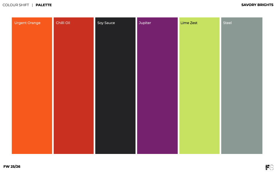
Savory Brights
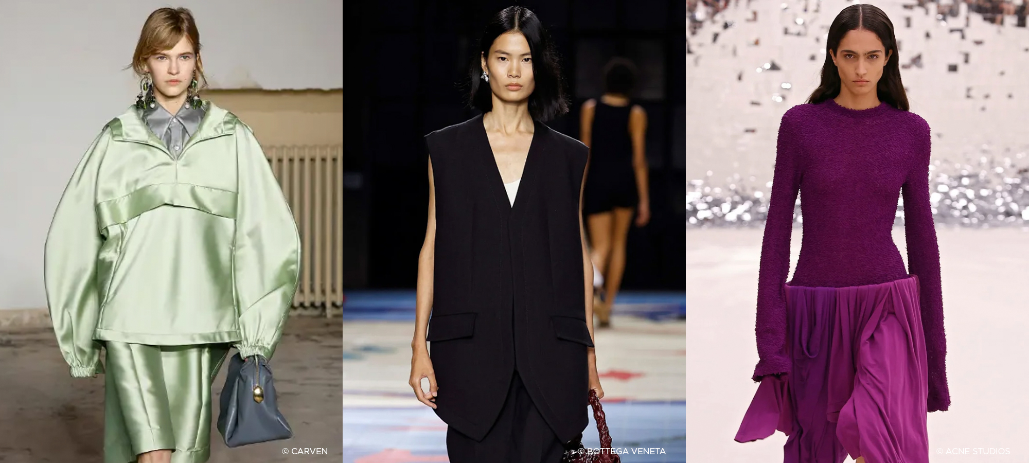
The inspiration for the colour palette called 'Savory Brights comes from the culinary world. Tantalising tastes, spicy notes and explosions of flavour play the leading role in this colour direction for autumn/winter 2025/26. The names of the colours hint at ingredients from the kitchen: 'Chilli Oil', 'Lime Zest' and 'Soy Sauce' are used to create a sense of surprise and challenge the taste buds. The palette is complemented by a purple berry shade, a colour that already plays a role in summer 2025, called 'Jupiter'.
The central colour to the palette is 'Urgent Orange'. It brings fiery intensity to the spectrum and features on the mood board with a groovy 60s vibe reminiscent of Paco Rabanne, Mary Quant, Sonia Rykiel and Vidal Sassoon.
The bold palette is reminiscent of bio-engineering and next-gen materials with its overall sense of new beginnings, exploration and innovation. The palette can be seen as a continuation of 'Eerie Greens' from the AW24/25 season and 'Unsettling Brights' from SS25.
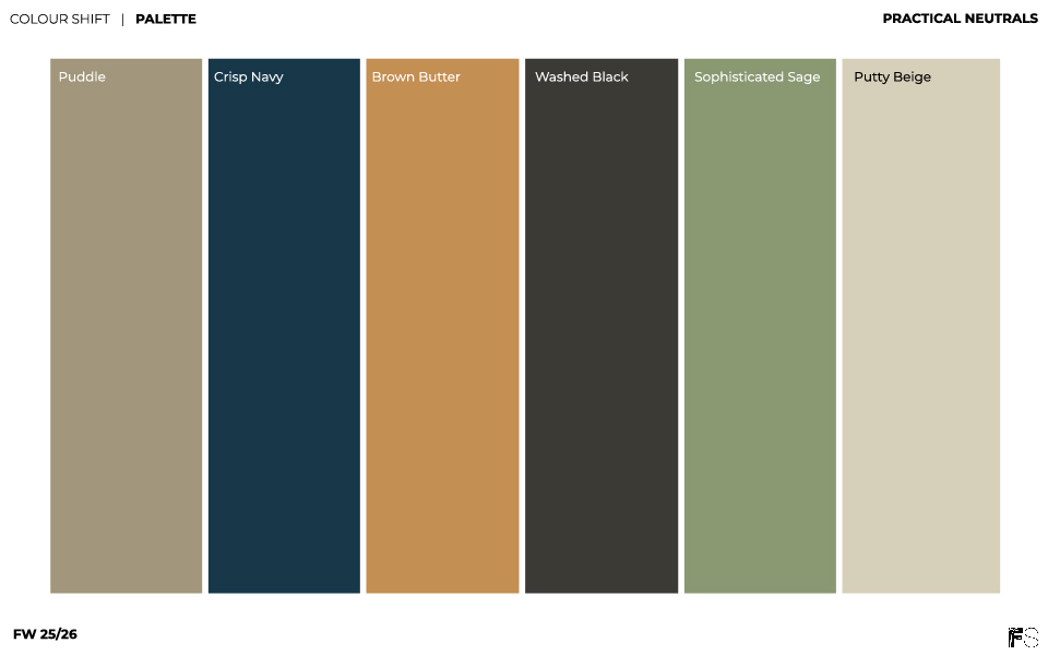
Practical Neutrals' Credits: Fashionsnoops
A much more subdued 'Practical Neutrals' palette consists of timeless colours. It's still about a quieter luxury. Refined brilliance, muted materials and deliberate shades emphasise a more sustainable perspective on fashion. The colour palette lends itself well to investment pieces, sustainable buys and instant classics. Stability, longevity and reliability are associated with these subtle colours full of elegance.
When it comes to materials, the experts mention brushed woollen fabrics, timeless denim and body-hugging knitwear as well as precious metals. It's all about conscious decisions, stability and sophistication. Two colours from SS25 are also adopted here, 'Puddle' and 'Washed Black' – two non-colour options with a timeless quality that underline the cross-seasonal theme of the range. They are complemented by 'Sophisticated Sage', 'Brown Butter' and 'Crisp Navy' as well as 'Putty Beige'.
The anchor colour of Practical Neutrals is 'Puddle', a 'greige' that exudes stability and timeless versatility. It offers a "versatile canvas" for colour combinations, for example it goes well with bold pastels like 'Lime Zest' from the previous palette or a soft purple like 'Smoothie'. However, it also harmonises with warmer neutrals such as 'Brown Butter' or 'Blazed Brown'.
The mood board is reminiscent of "sensible minimalism" that "combines purpose and aesthetics", as the experts emphasise. A sustainable choice that should be accompanied by durable shapes and materials such as vegetable-tanned leather.
Want to read more about inspiring colors? Click on the link below to read the entire article on FashionUnited.
www.FashionUnited.nl/Fashionsnoops
Written by: Barbara Russ, FashionUnited
Share article