Don’t have an account yet?
Create a free retailer account now or view the other options.

Create a free retailer account now or view the other options.
Openness, honesty and transparency have long been embraced and communicated by fashion brands. And today, an increasing number of brands are sharpening their focus on these values. In recent years, the physical 'face' of many fashion brands has undergone a transformation in an attempt to attract passing shoppers.
The skilled hands of renowned architects used a blend of clear materials to create almost see-through stores for these brands. Light and colour shoots through the façade, and just enough of the interior is visible to pique curiosity. The open and inviting look of the stores not only tempts you to have a peep inside, it entices curious passers-by over the threshold, into the store.
'Digital' transparency
Last spring, Louis Vuitton commissioned architects agency UNStudio to transform the exterior of their authentic Amsterdam town house into a futuristic, almost digital replica of its former self. The entire wall was replaced with stainless steel 'bricks' with glass inlays, giving the façade the illusion of being pixelated: as if the building is built from digital blocks instead of bricks. It's a contrasting, striking and appealing presence amongst the characteristic buildings of the district of Amsterdam Zuid, in the priciest shopping street in the Netherlands, the P.C. Hooftstraat.
See-through town house
MVRDV previously designed the modern see-through façade for Chanel's flagship store in the same street, using hundreds of specially-designed glass bricks. Hermès was more than pleased to move into the building last year, with its so-called 'dissolving wall': thanks to the meticulously chosen blend of unique glass bricks combined with the original terracotta bricks, the entire wall appears to dissolve right in front of you.
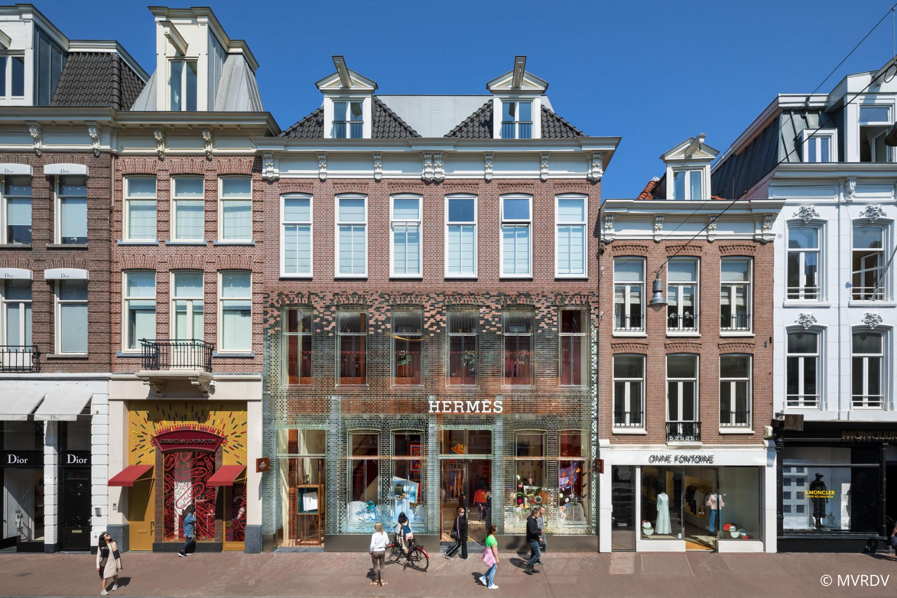
In order to avoid dramatically impacting the authentic look of the street, as often is the case with typical store fronts, the architect used the same building style as in the original. The look was instead utilised and emphasised, combined with a unique play on transparency. The result stimulates the senses, and as an added benefit, the construction is even stronger than the original brick design.
'Light, reflection, transparency and "clarity" are the perfect match for the spirit of the age'.
Light, reflection & contrast
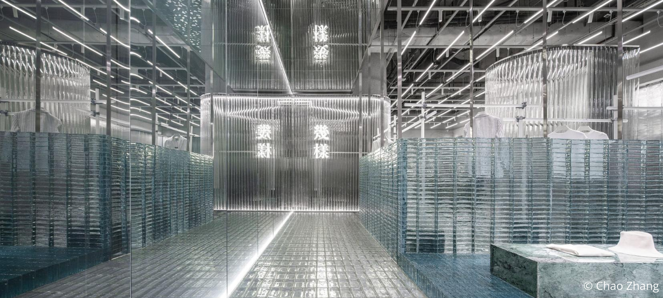
Glass is also used for complete shopping experiences. For example, Studio 10 - the architect used by the Chinese women's brand Geijoeng - went a step further than just the façade, opting for a total experience made from lots of glass, combined with other transparent, translucent and reflective materials. This minimalistic, sober clothing brand's studio has a glass brick floor, a mirrored ceiling, partitions made of tubes of translucent acrylic, and other transparent and gleaming materials were used for the counters and other elements. It lends the studio a surrealistic, dreamlike vibe, allowing the winter collection - in raw and contrasting materials, such as wool and velvet - to shine.
These store concepts appear to be the perfect match for the spirit of the age and the dominant social themes: reflection, transparency and 'clarity', both when it comes to ourselves, and to others. So why not also when it comes to our favourite brands and stores?
Written by Soraya Jahan
Share article